Custom UI5 Control
With Custom UI5 Control, you can create custom UI5 objects by extending existing in order to use them in the App Designer. Custom components offer significant benefits when working on large projects or collaborating with other developers:
- Reusability
-
Components can be reused across different sections, saving time and effort.
- Consistency
-
Components maintain a unified design and behavior throughout the website.
- Scalability
-
Components break down complexity and allow easy addition or modification of features.
- Maintenance and Updates
-
Changes can be made to specific components without impacting the entire website.
- Collaboration
-
Components enable parallel development and better code organization.
Configuring a Custom UI5 control
General
- Extended Control
-
Choose a UI5 object. For example: sap.m.SearchField
- Name
-
Name of the new object
- Description
-
Gives description to object
- Icon
-
Choose a UI5 icon
- Package
-
Adds the new object in a Package
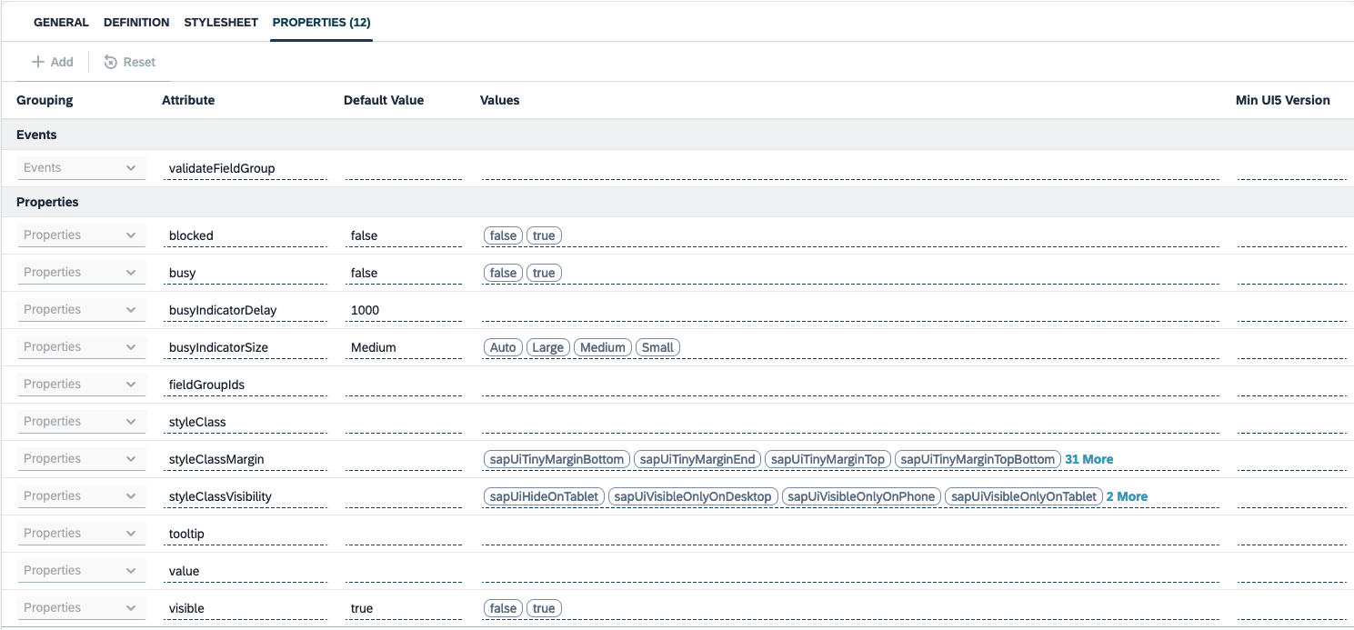
Definition
In Definition , you can apply custom logic to the object based on your needs.
Below is a code snippet for altering a sap.ui.core.Control
sap.ui.core.Control.extend("testInput", {  // Name of custom object

    // Do not change the declared name of the custom UI5 object

    metadata: {
        properties: {
            "value": "string", // in simple cases, just define the type
            "enableShadow2": {
                type: "boolean",
                defaultValue: false
            },
            "size": {
                type: "sap.ui.core.CSSSize",
                defaultValue: "200px"
            }
        },
        events: {
            "hover": {}
        }
    },

    renderer: function(oRm, oControl) {

        oRm.write("<div");
        oRm.writeControlData(oControl); // writes the Control ID and enables event handling - important!
        oRm.addStyle("width", oControl.getSize()); // write the Control property size; the Control has validated it
        // to be a CSS size
        oRm.addStyle("height", oControl.getSize());
        oRm.writeStyles();
        oRm.addClass("mySquare"); // add a CSS class for styles common to all Control instances
        oRm.writeClasses(); // this call writes the above class plus enables support
        // for Square.addStyleClass(...)

        oRm.write(">");
        oRm.writeEscaped(oControl.getText()); // write another Control property, with protection
        // against cross-site-scripting
        oRm.write("</div>");

    }

});