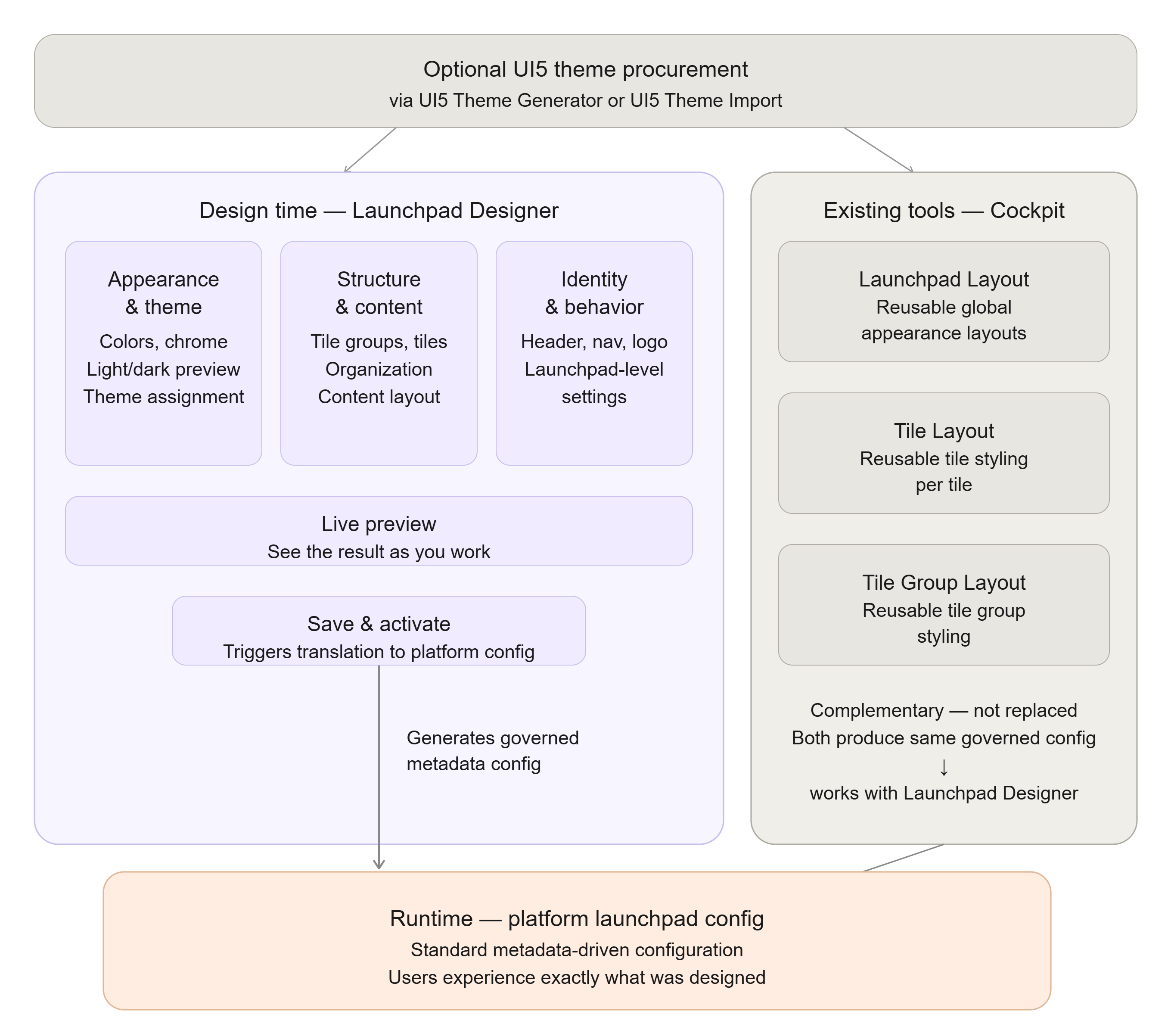
Launchpad Designer user interface at a glance
This topic provides orientation within the Launchpad Designer. It describes the purpose of the major areas of the workspace rather than every individual control, so it stays relevant as the interface evolves.
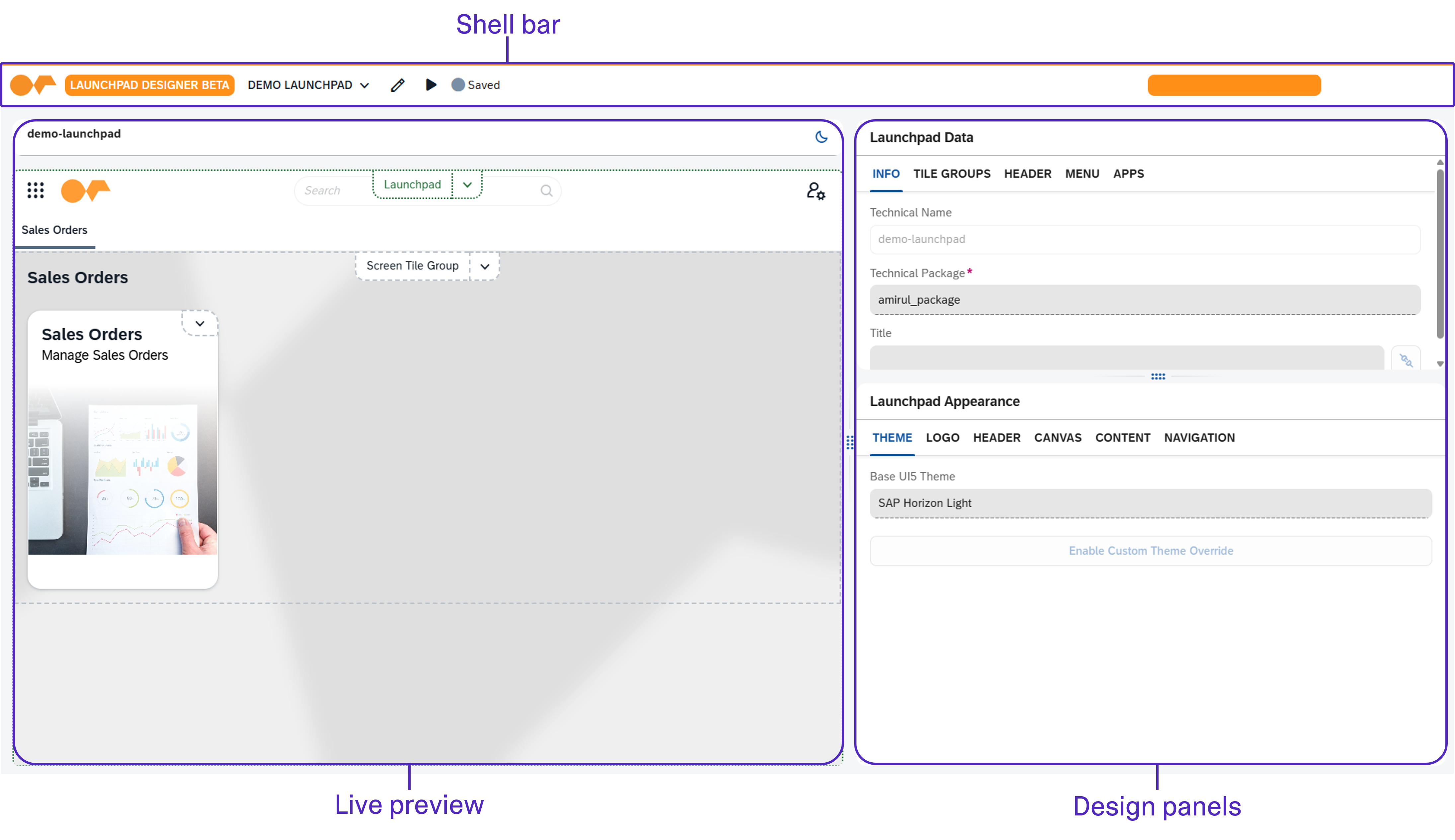
Major areas of the workspace
- Live preview
-
A representation of the launchpad that updates as you design, so you can judge the result in context. You can switch the preview between light and dark appearance to check both before activating.
- Design panels
-
Grouped settings for the launchpad. These cover appearance and theme, the launchpad structure (tile groups and tiles), and launchpad-level settings such as header, navigation, and logo. Related settings are grouped, so you can work on one aspect of the design at a time.
Shell bar
- Edit mode
-
While editing, selecting an element in the preview targets it for design rather than triggering its runtime action, so you can choose what to work on without leaving the Designer.
- Change indicators
-
The Designer tracks which parts of the design differ from the saved configuration, so you can see at a glance where you have made changes before saving.
- Save and activate
-
Persists the design and generates the governed launchpad configuration used at runtime.
How the workspace maps to the runtime user launchpad experience
The areas of the workspace correspond to parts of the running launchpad: the appearance and theme settings determine how the launchpad chrome is colored and themed, and the structure settings determine which tile groups and tiles appear and how they are organized. Because the design is translated into the platform’s standard launchpad configuration on activation, what you arrange at design time is what users experience at runtime.