Preview
The preview is a pane that displays the visual application preview based on the components used in the application tree when creating an application.

In the App Designer preview, you can see a preview of your application. Run a preview by selecting Run in Designer in the preview toolbar. If you activated the preview and edited your application, update the preview by selecting Activate in the shell bar.
Preview toolbar
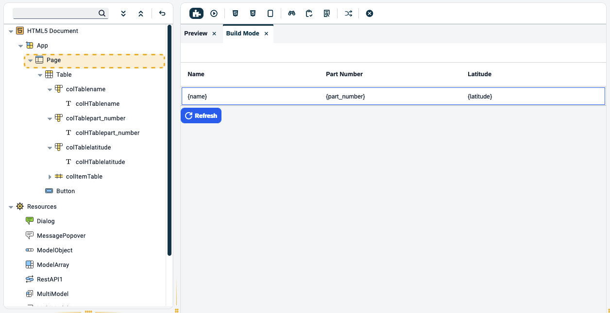
Build Mode
Build mode allows users to test visual changes without activating the application. It operates solely on the front end, ensuring that no changes are saved permanently. This mode proves invaluable for tasks like adjusting button dimensions and previewing outputs without the need for activation.
You can enter comments in code within the build mode by formatting these manually in the preview pane or selecting the keyboard shortcut Ctrl + \ (Windows)/ Command + \ (macOS).
Display and version compatibility
The content displayed in build mode is dependent on the UI5 version selected for the app. If the user changes the version, build mode transitions to the new version, rendering content accordingly. The same principle applies to the selected theme; content is displayed in the chosen theme. Any change in theme selection results in an immediate update in content appearance.
| Neptune DXP - Open Edition provides the locally installed OpenUI5 versions 1.71, 1.108, and 1.120 for use in user-made applications. The OpenUI5 version 1.108 is the default version for all new applications. |
Design mode
In build mode, all interactive actions are disabled. For example, selecting a button that would normally trigger a pop-up will not have any effect in this mode.
| Build mode exclusively supports only OpenUI5 components. All stylesheets within the application are not utilized during the build mode rendering. Also, you will be able to see the binding source but not the data generated from the binding. |
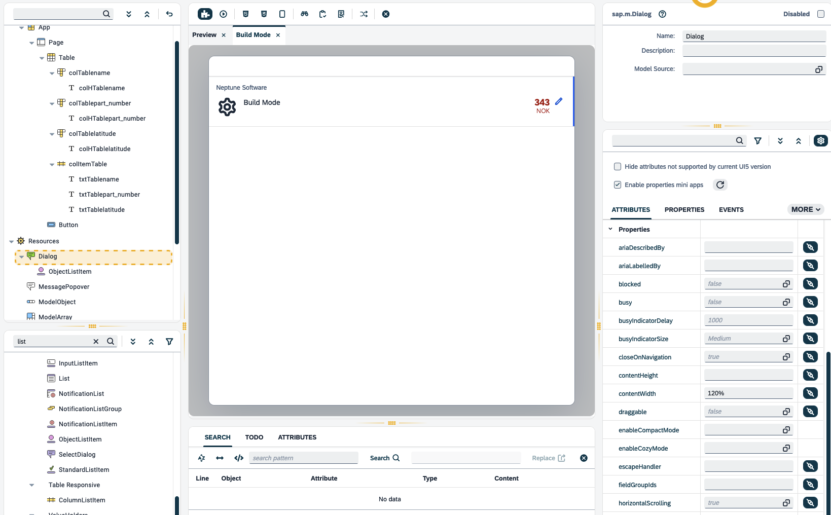
To render the content of the tree, based on the selected object:
-
Select the component you would like to render.
-
Activate Build Mode.
This will create a new tab in the preview pane displaying the selected component.
This feature becomes useful when dealing with components like
sap.m.MessagePopover, sap.m.MessagePopover and other components that can be
previewed only when the application is running. Here is a list of the current
components which are available on Build Mode:
-
sap.f.DynamicPage -
sap.m.ActionSheet -
sap.m.BusyDialog -
sap.m.Dialog -
sap.m.LightBox -
sap.m.MessagePopover -
sap.m.Popover -
sap.m.QuickView -
sap.m.ResponsivePopover -
sap.m.SelectDialog -
sap.m.TableSelectDialog -
sap.m.ViewSettingsDialog
Here is an example of one of the above components being selected and then viewed in Build Mode.
If you are using multiple component objects which are listed above, and you want to view them in Build Mode, simply select the component object in the Application tree and then activate Build Mode.
| Right-click a script tab to select the associated component object in the Application tree. |
Run in Designer
When running a preview, you can choose between different settings to test the look of your application on different devices. Select > Settings to access the preview settings.
-
Screen size
-
Orientation
-
Background image
-
Type (Application/Launchpad)
-
Application must be filled if the Type is Launchpad
-
-
Outline UI5 Elements will highlight the components in the preview pane that are currently in use.
The preview settings only apply to the preview in the preview pane.
Stylesheet
Add custom CSS to your application. SCSS is also supported, which is then compiled into CSS at runtime.
Web App Manifest
The web app manifest is a JSON file that contains essential information about a web application, such as its name, icons, start URL, and display mode. It helps define the behavior and appearance of the web application when installed on a user’s device.
The most common use for a web application manifest is to provide information that the browser needs to install a progressive web app (PWA) on a device, such as the application’s name and icon.
| The middle mouse button can close the above tabs. |
Filter editor tabs
To filter among multiple open script tabs by keyword name in the Editor of the Preview pane, select the filter icon.
Search pane
Open or close the search pane via keyboard shortcut F6 or in the menu, and search for scripts, objects, attributes, to-dos, or worklist items in the code of the application. You can toggle the following search scopes off and on:
-
Case-sensitive search (for example,
Scriptorscript) -
Whole word search (for example, only
Script) -
Regex search (for example,
Script[2-4]to surfaceScript2,Script3, andScript4) -
Object type/attribute filter search (for example, Object Type:
sap.m.FlexBox, Attribute:visible)
Filter your search according to one or more, or all of the following search scope types:
- Script search
-
Search throughout all the application code, and
header/htmlandstylesheet/scssfiles. Allows replacing the searched queries with a given value. - Object search
-
Search objects from the application tree according to object name. Retrieved hits are listed in the object search with the object name and object type. Unique hits are highlighted directly in the application tree.
- Attribute search
-
Search objects from the application tree according to attributes.
- To-do list
-
Will list all places in scripts that have the comments
TODO,FIXME,XXX,OPTIMIZE, andREVIEW.
Writing //TODO your description anywhere within your application code will
show within the TODO list search results.
|
- Worklist
-
Frequently used components can be added to the worklist, allowing quick access to a specific component without navigating through the folder structure of a given script.
| Close all open tabs by selecting the button. |