Layout, Application and Text tab
-
In the Layout panel, you can customize the look of the home and the login screen.
-
In the Application panel, you can define tab width and print width.
-
In the Text panel, you can define text modules that are shown on the login screen.
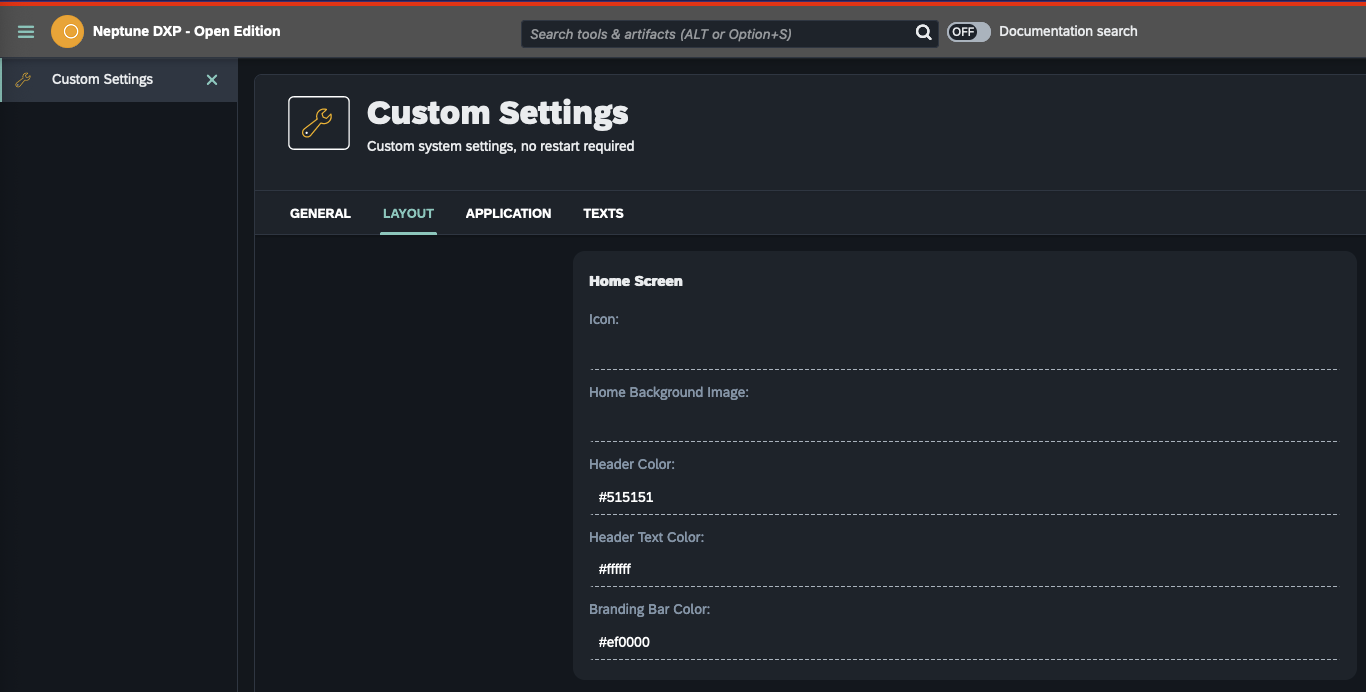
Layout
Customize your system screens.
Home screen
Define the look of your home screen.
- Icon
-
Add an icon from the Media Library to your home screen.
- Home Background Image
-
Add an image from the Media Library as a background to your home screen.
- Header Color
-
Define a header color with the built-in color palette.
- Header Text Color
-
Define a text color with the built-in color palette.
- Branding Bar Color
-
Define a color for the thin bar at the top of the cockpit with the built-in color palette.
An example of a few customized settings, with white text, a grey background, and a red branding bar:
Home screen tiles
You have the following options:
-
Hide system information tile
-
Hide license tile
-
Hide updates tile
-
Hide featured DXP Marketplace tile
Login screen
Define the look of your login screen.
- Login Image
-
Add an image from the Media Library to your home screen.
- Background Color
-
Define a background color with the built-in color palette.
- Password Reset Email
-
Add an email address to receive emails with password reset instructions when you have forgotten your login password.
- Login App
-
Add an application that you want to use for login. This application can be downloaded from the Neptune DXP Marketplace as an application building block.
- NOTE
-
If the custom login app is broken and can’t be used to log in to the system, the default login page can be accessed from /public/login.html
Text
Define three text modules that you can show on your login screen. Use the text modules for privacy policy or other information to your end-users.