Designer
The Designer is the central starting point for designing forms with Neptune Forms.
This is where you design the interface of your form, configure settings (such as if fields are required) and implement functionalities (such as conditional visibility).
The Designer has the following key features:
-
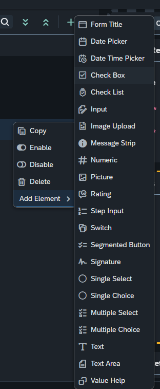
Provides you with over 20 essential elements to construct custom forms, ranging from checklists, inspection sheets, surveys and more.
-
Every form is automatically responsive and can be utilized on desktops, tablets, and mobile devices
-
Dynamic capabilities such as:
-
Conditional visibility
-
Value help assistance (populating an input) via the Adaptive Framework
-
Multiple configuration options
-
Customizable layouts
-
-
Integration with No-Code Adaptive Applications and Low-Code App Designer Applications
Designer user interface at a glance : Preview Section
The preview is a pane that displays the visual application preview based on the components used in the application tree when creating an application.
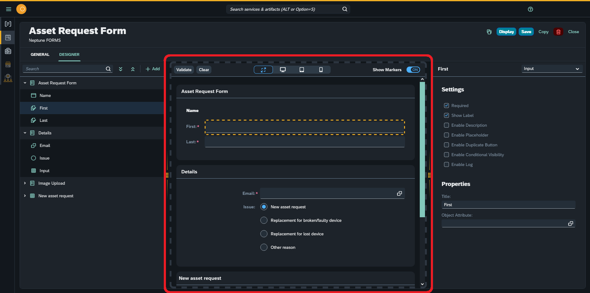
In the Designer preview, you can see a preview of your form.
Preview toolbar
The preview toolbar consists of the following items to adjust the preview and make changes to the form:
- Validate
-
Checks if the form is valid when it is filled with data
- Clear
-
Clears all inputs
- Responsive Design Mode
-
Enables web users or developers to modify the resolutions of a web page to view the mobile or tablet versions of the web page
- Show Markers
-
Places a marker around the component element when a user clicks
Designer user interface at a glance : Component Tree Section
The component tree is a panel that displays the components you use from the component library when creating your form. The used components are displayed hierarchically (top to bottom, with parent child relationships), clicking on them allows you to edit their properties on the right properties panel.
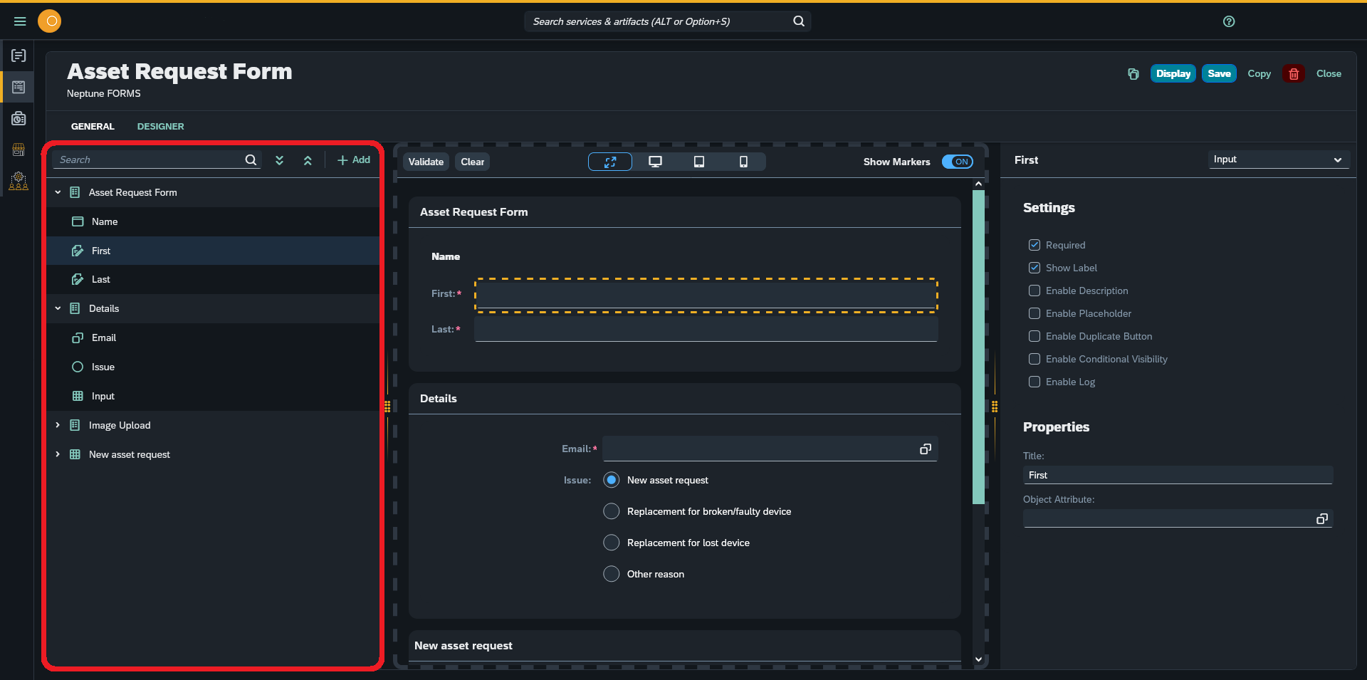
You can expand and collapse components in the tree to navigate the structure of your application and drag and drop components to change their place within the structure. When clicking a component in the components tree, you can see its properties in the properties panel.
The component tree always shows the current state of your application.
Designer user interface at a glance : Properties & Settings Panel
The properties and settings panel consists of two stacked panes:
-
The settings pane
-
The properties pane
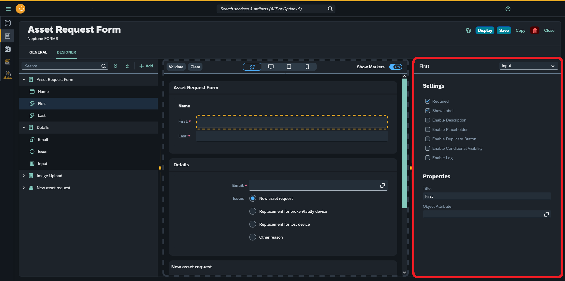
In this section, you can edit selected components located and selected in the Component Tree Section.
Here, the panel shows basic properties, such as name and description.
Configuring the Settings & Properties
Forms
Settings:
- Compact mode
-
Shrinks all components (vertically) and makes the form more firm
- Label left Align
-
Moves labels to the left side of the form
- Enable Conditional Visibility
-
Disables or enables the visibility of the current form according to a selected value
Properties:
- Title
-
Gives a title to the form on the top left side
- Object Attribute
-
Replaces the key name with the given object attribute
| Object Attributes are defined in the Attribute tile. For each attribute you may declare multiple of field keys. These keys will be reflected in the Designer |
- Label Span
-
Shrinks all components (horizontally) from a scale of 1 to 11. Label Span number 12 place all label names over their component
Tables
Settings:
- Compact mode
-
Shrinks all components (vertically)
- Show Separator
-
Separates columns with a small line
- Show Alternate Row Colors
-
Assigns a different color for consecutive rows
- Show Row Number
-
Displays the number of each row in the table
- Enable Filter
-
Applies filtering for the table (a search field will become visible when this setting is enabled)
- Enable Pagination
-
Applies pagination to the table, and you can control the number of items per page
- Enable Delete
-
Deletes the corresponding row while using the Form, only during the forms runtime
- Enable Create
-
Creates a new row, only during the forms runtime
- Enable Copy
-
Copies the entire table (including data) and creates a new copy, only during the forms runtime
- Enable Conditional Visibility
-
Disables or enables the visibility of the current table according to a selected value
Properties:
- Title
-
Gives a title to the table on the top left side
- Object Attribute
-
Replaces the key name with the given object attribute
- Number of Rows
-
Specifies the total number of rows for the table
- Vertical Align
-
Aligns components vertically
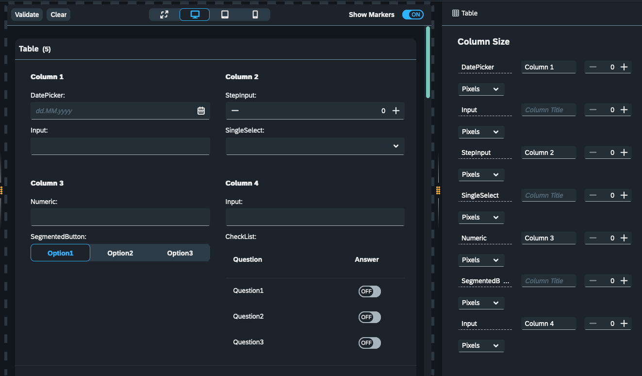
- Column Size
-
Sets the size for each component
Note: When dealing with complex Table designs, use Column Size to breakdown the table into multiple columns for a better user experience.