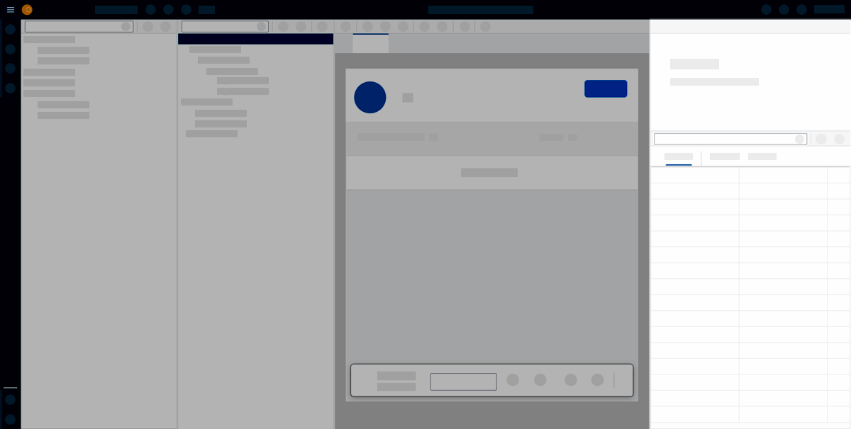
Component properties
The component pane consists of two stacked panes: the UI object pane and the properties pane.

In the App Designer object properties, you can edit components you have selected in the application tree. The UI object pane shows basic properties, such as name, description or paths to connected resources.
In the properties pane, you define the component in detail. Select from predefined values, enter new values, bind data from resources, or add scripts to events.
You can access relevant information and documentation about the component by selecting the icon next to its title.
Component settings
The setting will give you the following options to enable or disable:
- Hide attributes not supported by current UI5 version
-
Keep in mind that you have the option to change the UI5 version in the main Settings of your application. Consequently, certain components may lack support for specific attributes or properties, and these will not be displayed in the component pane.
- Enable properties mini apps
-
This feature allows certain properties of a component to be displayed in a more user-friendly format for improved readability.
| If you right-click on edited values for Attributes, Properties, Formatter, or Events, a pop-up will appear to allow you to reset them to their default values. |